Cost, Performance, and Benchmark Bias of Public Pension Funds in the United States: An Unflattering Portrait
The beneficiaries of defined-benefit pension plans for state and local public employees in the United States include 14.7 million active workers and 11.2 million retirees. The stakeholders—public workers and taxpayers—have no real say in the management of plan assets, which total $5.5 trillion. The plans are largely funded by taxpayers and are notoriously underfunded, with an average ratio of assets to liabilities of 74%. Required contribution rates have risen from 5% of covered payroll to nearly 18% in the past 20 years, with every indication that the rates will continue to rise.[1] Investment earnings are an important source of revenue for the funds, but there is limited independent review of fund performance. The funds self-report their investment returns annually with no independent verification. The funds use performance benchmarks of their own devising, which often lack transparency. These facts underscore the importance of independent scrutiny of the performance of public pension funds and their performance reporting practices.
OVERVIEW
First I estimate the typical cost of operating statewide pension funds by using a variety of data sources. I then employ two approaches in analyzing investment performance: (1) Sharpe ratio and (2) passively investable benchmarks comprising multiple stock and bond market indexes. The two approaches, both rooted in finance theory, produce consistent results, with the latter being potentially more informative than the former. Next, I discuss performance measurement as practiced by public employee pension funds in the United States. Employing benchmarks of their own devising, the funds take a different approach in the self-evaluation of their performance. I compare and contrast my results with those reported by a sample of 24 large funds and find significant differences. Examination of the differences raises questions about the integrity of performance benchmarking as practiced by public pension funds in the United States.
DATA AND METHODOLOGY
Annual rates of return between July 1, 2010, and June 30, 2020, are used in the study. Returns for individual funds were obtained from their annual reports and from the Public Plans Data website of the Center for Retirement Research at Boston College. A number of limitations in sourcing data for this study exist, however. The research design requires at least 10 years of rate of return data for each fund analyzed. All returns are self-reported. Only fiscal-year annual returns are reported (no monthly or quarterly data). The analytical approach requires that the funds studied have a common fiscal year-end. The most common fiscal-year end among public pension funds is June 30, so I chose that for inclusion in the sampling. I require strong indication that the returns reported are fully net of investment expenses. (About one out of three funds fails to meet this criterion.) In addition to securing the funds’ reported rates of return, the research design requires 10 years of data for the performance benchmark used by each of them. The final dataset consists of the 24 largest statewide funds meeting the criteria.
I use two approaches to evaluate fund performance. The first, the Sharpe ratio, results from dividing a fund’s return in excess of the risk-free rate (the risk premium) by its standard deviation of return (risk). It is a generalized measure of return per unit of risk. The second approach uses a benchmark that is the combination of market indexes that has the best statistical fit with the return series of a particular portfolio. It yields a benchmark rate of return that can be subtracted from the portfolio’s return to yield excess return. Sharpe (1988, 1992) pioneered this technique, employing a constrained multiple regression to establish the weights of independent variables (market indexes) to serve in construction of the benchmark.[2] Sharpe’s method results in a static allocation over time to the various market indexes.[3]
ESTIMATING INVESTMENT COST
The cost of investing plays an important, often-overlooked, role in determining how well investment portfolios perform. According to a dictum among finance scholars, to the extent markets are efficient, diversified portfolios can be expected to underperform a properly constructed benchmark by the margin of their cost. There is ample evidence to support the dictum.[4]
Public pension funds report average annual investment expenses on the order of 0.4% of asset value.[5] The great majority of them, however, report just a fraction of their investment costs in their annual reports. CEM Benchmarking estimates that the funds underreport their costs by at least half.[6] Reported costs typically include investment manager fees invoiced to the fund. Real estate and private equity fees netted against returns, and many performance-related fees, are often not reported or are underreported. Consequently, published data regarding public funds’ investment costs are generally incomplete and of little value in gauging the true (full) cost of investment.[7]
Notwithstanding the general paucity of comprehensive cost data, there are a few helpful reference points. The Pew Charitable Trusts, in its 2016 study “Making State Pension Investments More Transparent,” provides two case studies of full disclosure. One describes a review of the costs of the South Carolina Retirement System for fiscal year 2013. The other case study is for the Missouri State Employees’ Retirement System (MOSERS) for the same year. In both cases, a rigorous effort was made to ascertain the total investment cost of the funds using detailed accounting data. The total cost figure reported in the Pew study for South Carolina was 1.58% of fund assets. MOSERS’s total cost figure was 1.65% of assets. Separately, the Institute for Illinois’ Fiscal Sustainability at the Civic Federation (2019) reported on a study of all-inclusive investment costs for the Teachers’ Retirement System of the State of Illinois (TRS) in 2016. Prior to that year, like most funds, TRS reported only a portion of its expenses, which amounted to 0.70% of assets in 2015. When TRS embraced more comprehensive reporting by including performance fees for alternative investments, the figure rose to 1.58%.
I estimate the cost of investment incurred by statewide funds in the aggregate relying on data from a variety of sources. Center for Retirement Research at Boston College is the source of the asset allocation percentages shown in Exhibit 1. Cost estimates for individual asset classes are taken from a variety of sources. Exhibit 1 summarizes the results of the analysis. The estimated overall cost of investment management for public pension funds, i.e., their expense ratio, is 1.2% of asset value per year. The range of cost for individual funds is wide. The handful of pension funds that are largely passively invested with few if any alternative investments (e.g., those of the Georgia Teachers Retirement System and the state of Nevada), experience costs of approximately 0.3% per year. Ones with allocations of about 50% to alternative investments experience costs of approximately 2.0% per year. A key determinant of the overall cost of investing is the size of the allocation to alternative asset types, which are approximately 10 times more costly that traditional ones.
Exhibit 1
Estimated Investment Expense for Public Pension Funds
|
Asset Class |
Approximate Cost Rate as a Percentage of Value |
Percentage of Total Assets |
Expense Ratio |
|
Equities |
0.35%[8] |
46.4% |
0.16% |
|
Fixed Income |
0.25 |
23.3 |
0.06 |
|
Cash |
0.00 |
2.4 |
— |
|
Other |
0.00 |
0.1 |
— |
|
Subtotal Traditional |
|
72.2% |
0.22% |
|
Private Equity |
6.00[9] |
9.3 |
0.56 |
|
Real Estate |
2.30[10] |
8.8 |
0.20 |
|
Hedge Funds |
3.00[11] |
6.4 |
0.19 |
|
Commodities |
0.80[12] |
1.8 |
0.02 |
|
Misc. Alternatives |
1.00 |
1.4 |
0.01 |
|
Subtotal Alternative |
|
27.7 |
0.98 |
|
Total |
|
100.0% |
1.20% |
Figures may not sum to 100% due to rounding.
PERFORMANCE EVALUATION: IN PRINCIPLE
Sharpe Ratio
The Sharpe ratio is a universal measure of investment performance. It does not require specification of a market model or the identification of any market index(es) for comparative purposes. All it requires is knowledge of a portfolio’s return, the risk-free rate, and the standard deviation of portfolio returns. Sharpe ratios produce ordinal rankings of portfolio performance, which is adequate for some purposes. For each of the 24 public pension funds in the dataset, Exhibit 2 reports the annualized return for 10 years ended June 30, 2020. It also includes each fund’s standard deviation of return (risk) and the Sharpe ratio.
Exhibit 2
Return, Standard Deviation, and Sharpe Ratio
for 24 Statewide Pension Funds
(10 years ended June 30, 2020)
|
Fund Name |
10-Year Annualized Return |
Standard Deviation |
Sharpe Ratio |
|
Arizona (SRS) |
8.90% |
8.25% |
1.01 |
|
California (PERS) |
8.50 |
7.37 |
1.08 |
|
California (STRS) |
9.30 |
7.36 |
1.19 |
|
Florida |
8.69 |
7.46 |
1.09 |
|
Illinois (SERS) |
8.70 |
7.42 |
1.10 |
|
Illinois (TRS) |
8.30 |
7.94 |
0.98 |
|
Iowa (PERS) |
8.58 |
5.83 |
1.38 |
|
Maine |
8.30 |
7.45 |
1.04 |
|
Minnesota |
9.70 |
7.65 |
1.20 |
|
Missouri (SERS) |
6.80 |
7.74 |
0.81 |
|
New Jersey |
7.99 |
6.61 |
1.13 |
|
New Mexico (PERA) |
7.50 |
8.14 |
0.85 |
|
N.Y. State (Teachers) |
9.60 |
7.04 |
1.28 |
|
North Carolina |
7.70 |
5.93 |
1.21 |
|
Ohio (School Employees) |
8.60 |
7.10 |
1.13 |
|
Oregon |
8.51 |
7.24 |
1.10 |
|
Pennsylvania (PSE) |
7.70 |
6.21 |
1.15 |
|
Rhode Island |
7.80 |
6.58 |
1.10 |
|
South Carolina |
6.71 |
6.97 |
0.88 |
|
South Dakota |
9.41 |
8.86 |
1.00 |
|
Texas (Teachers) |
8.50 |
6.86 |
1.16 |
|
Vermont (Teachers) |
7.20 |
6.08 |
1.09 |
|
Virginia |
8.10 |
6.24 |
1.21 |
|
Washington |
9.35 |
6.53 |
1.35 |
|
|
|
|
|
|
Average |
8.35% |
7.12% |
1.10 |
Exhibit 3 sorts the return, standard deviation, and Sharpe ratio in descending order. It reveals that the range of all three measures is substantial. In Panel A, nearly 300 bps separates the highest and lowest 10-year return. In Panel B., the highest risk measure (8.86%) is 52% greater than the lowest (5.83%). In Panel C, the highest Sharpe ratio (1.38) is 70% greater than the lowest (0.81).
Exhibit 3
Return, Standard Deviation, and Sharpe Ratio
in Descending Order
|
A. 10-Year Return
|
B. Standard Deviation
|
C. Sharpe Ratio
|
|
9.70% |
8.86% |
1.38 |
|
9.60 |
8.25 |
1.35 |
|
9.41 |
8.14 |
1.28 |
|
9.35 |
7.94 |
1.21 |
|
9.30 |
7.74 |
1.21 |
|
8.90 |
7.65 |
1.20 |
|
8.70 |
7.46 |
1.19 |
|
8.69 |
7.45 |
1.16 |
|
8.60 |
7.42 |
1.15 |
|
8.58 |
7.37 |
1.13 |
|
8.51 |
7.36 |
1.13 |
|
8.50 |
7.24 |
1.10 |
|
8.50 |
7.10 |
1.10 |
|
8.30 |
7.04 |
1.10 |
|
8.30 |
6.97 |
1.09 |
|
8.10 |
6.86 |
1.09 |
|
7.99 |
6.61 |
1.08 |
|
7.80 |
6.58 |
1.04 |
|
7.70 |
6.53 |
1.01 |
|
7.70 |
6.24 |
1.00 |
|
7.50 |
6.21 |
0.98 |
|
7.20 |
6.08 |
0.88 |
|
6.80 |
5.93 |
0.85 |
|
6.71 |
5.83 |
0.81 |
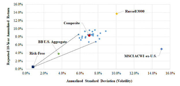
Exhibit 4 is a risk–return diagram whereby each fund and an equally weighted composite of them is represented by their 10-year annualized return and standard deviation. Three market indexes are also shown. One is a broad index of the US equity market (Russell 3000); one represents non-US equity markets (MSCI ACWI ex-U.S.); and the third represents investment-grade US bonds (Bloomberg Barclays US Aggregate). The highest and lowest Sharpe ratios are indicated by lines emanating from the risk-free rate. The fund plot points form a tight “shot group” when arrayed with market indexes representing the funds’ principal areas of investment. This is an indication that their investment strategies (and the execution of them) are fairly homogenous.
Exhibit 4
Risk and Return
(10 years ended June 30, 2020)
Although the Sharpe ratio enables the analyst to rank the performance of funds, it does not provide an explicit measure of return in excess of a passively investable benchmark. That is the subject of the next section.
Excess Return
Excess return is defined here as the difference between the observed return for a fund (or composite) and a blended benchmark comprising stock and bond indexes. I employ the methodology of Sharpe (1988, 1992), regressing fund (and composite) return series against three broad, non-overlapping market indexes, namely, the Russell 3000 stock index, the MSCI ACWI ex-U.S. stock index, and the Bloomberg Barclays US Aggregate bond index. The regression is constrained such that all the betas (weights) are nonnegative and sum to 100% (neither leverage nor short sales being permitted in other words). The resulting benchmark (1) fits (statistically) the subject return series better than any other combination of the three indexes and (2) is passively investable. These are prime characteristics of a valid performance benchmark. I refer to these as passively investable, empirical benchmarks, or just empirical benchmarks (EBs).
For each of the 24 funds and their composite, Exhibit 5 shows the 10-year annualized return of each fund and its respective EB, resulting from the returns-based analysis described previously. It also shows the R2 and tracking error of the return series relative to benchmark and the excess return of the return series relative to that of the benchmark. The median R2 is 0.975 and median tracking error is 1.17%, indicating that the return series have a close statistical fit with their EBs. The tight-fit statistics also reveal an important characteristic of public pension funds—namely, their extreme degree of diversification. (Large public pension funds use an average of 188 investment managers.[13]) The average excess return is –1.41% a year, indicating the average margin of underperformance of the funds relative to passively investable benchmarks.
Exhibit 5
Development of Empirical Excess Return
|
Fund Name |
Reported 10-Year Annualized Return |
Empirical Benchmark Return |
R2 |
Tracking Error with Empirical Benchmark |
Excess Return
|
|
Arizona (SRS) |
8.90% |
10.4% |
.979 |
1.20% |
-1.55% |
|
California (PERS) |
8.50 |
9.7 |
.991 |
0.68 |
-1.18 |
|
California (STRS) |
9.30 |
10.2 |
.993 |
0.62 |
-0.92 |
|
Florida |
8.69 |
9.1 |
.990 |
0.77 |
-0.44 |
|
Illinois (SERS) |
8.70 |
9.9 |
.982 |
1.01 |
-1.24 |
|
Illinois (TRS) |
8.30 |
11.5 |
.980 |
1.14 |
-3.23 |
|
Iowa (PERS) |
8.58 |
8.3 |
.967 |
1.07 |
0.31 |
|
Maine |
8.30 |
8.8 |
.971 |
1.28 |
-0.47 |
|
Minnesota |
9.70 |
9.8 |
.988 |
0.88 |
-0.06 |
|
Missouri (SERS) |
6.80 |
10.8 |
.871 |
2.88 |
-3.99 |
|
New Jersey |
7.99 |
9.6 |
.921 |
1.93 |
-1.64 |
|
New Mexico (PERA) |
7.50 |
11.0 |
.958 |
1.68 |
-3.51 |
|
N.Y. State (Teachers) |
9.60 |
11.0 |
.987 |
0.80 |
-1.44 |
|
North Carolina |
7.70 |
8.0 |
.990 |
0.59 |
-0.28 |
|
Ohio (School Employees) |
8.60 |
9.5 |
.980 |
1.04 |
-0.90 |
|
Oregon |
8.51 |
11.3 |
.961 |
1.45 |
-2.76 |
|
Pennsylvania (PSE) |
7.70 |
9.7 |
.913 |
1.84 |
-2.03 |
|
Rhode Island |
7.80 |
9.0 |
.991 |
0.64 |
-1.18 |
|
South Carolina |
6.71 |
8.8 |
.931 |
1.87 |
-2.13 |
|
South Dakota |
9.41 |
12.8 |
.970 |
1.54 |
-3.40 |
|
Texas (Teachers) |
8.50 |
9.5 |
.953 |
1.50 |
-0.96 |
|
Vermont (Teachers) |
7.20 |
8.2 |
.981 |
0.85 |
-1.01 |
|
Virginia |
8.10 |
9.1 |
.945 |
1.54 |
-1.02 |
|
Washington |
9.35 |
8.1 |
.970 |
1.19 |
1.27 |
|
|
|
|
|
|
|
|
Composite (Average / Median) |
8.35% |
9.76% |
.975* |
1.17%* |
-1.41% |
*Median
Exhibit 6 is the same as Exhibit 5, but is sorted based on excess return. The range of excess return is even greater than the range of total return. Washington’s excess return (at +1.27% a year) is greater than that of Missouri (–3.99% a year) by 526 bps a year.[14]
Exhibit 6
Excess Return in Descending Order
|
Fund |
Reported 10-Year Annualized Return |
Empirical Benchmark Return |
R2 |
Tracking Error with Empirical Benchmark |
Excess Return
|
|
Washington |
9.35% |
8.1% |
.970 |
1.19% |
1.27% |
|
Iowa (PERS) |
8.58 |
8.3 |
.967 |
1.07 |
0.31 |
|
Minnesota |
9.70 |
9.8 |
.988 |
0.88 |
-0.06 |
|
North Carolina |
7.70 |
8.0 |
.990 |
0.59 |
-0.28 |
|
Florida |
8.69 |
9.1 |
.990 |
0.77 |
-0.44 |
|
Maine |
8.30 |
8.8 |
.971 |
1.28 |
-0.47 |
|
Ohio (School Employees) |
8.60 |
9.5 |
.980 |
1.04 |
-0.90 |
|
California (STRS) |
9.30 |
10.2 |
.993 |
0.62 |
-0.92 |
|
Texas (Teachers) |
8.50 |
9.5 |
.953 |
1.50 |
-0.96 |
|
Vermont (Teachers) |
7.20 |
8.2 |
.981 |
0.85 |
-1.01 |
|
Virginia |
8.10 |
9.1 |
.945 |
1.54 |
-1.02 |
|
California (PERS) |
8.50 |
9.7 |
.991 |
0.68 |
-1.18 |
|
Rhode Island |
7.80 |
9.0 |
.991 |
0.64 |
-1.18 |
|
Illinois (SERS) |
8.70 |
9.9 |
.982 |
1.01 |
-1.24 |
|
N.Y. State (Teachers) |
9.60 |
11.0 |
.987 |
0.80 |
-1.44 |
|
Arizona (SRS) |
8.90 |
10.4 |
.979 |
1.20 |
-1.55 |
|
New Jersey |
7.99 |
9.6 |
.921 |
1.93 |
-1.64 |
|
Pennsylvania (PSE) |
7.70 |
9.7 |
.913 |
1.84 |
-2.03 |
|
South Carolina |
6.71 |
8.8 |
.931 |
1.87 |
-2.13 |
|
Oregon |
8.51 |
11.3 |
.961 |
1.45 |
-2.76 |
|
Illinois (TRS) |
8.30 |
11.5 |
.980 |
1.14 |
-3.23 |
|
South Dakota |
9.41 |
12.8 |
.970 |
1.54 |
-3.40 |
|
New Mexico (PERA) |
7.50 |
11.0 |
.958 |
1.68 |
-3.51 |
|
Missouri (SERS) |
6.80 |
10.8 |
.871 |
2.88 |
-3.99 |
Comparison of the Sharpe Ratio and Excess Return Measures
I employed two measures of investment performance for the funds, Sharpe ratio, and excess return. Here we examine the extent to which they are consistent in terms of their results. To do this, I regress the Sharpe ratios (Exhibit 2) against excess return (Exhibit 5). Exhibit 7 illustrates a strong, direct relationship between the two measures. The slope coefficient has a t-statistic of 6.2. The R2 is 0.64. In other words, the two measures produce consistent results. Excess return has the advantage over the Sharpe ratio of providing an intuitive measure of performance relative to passive investment.
Exhibit 7
Relationship of Sharpe Ratios and Excess Returns
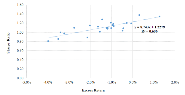
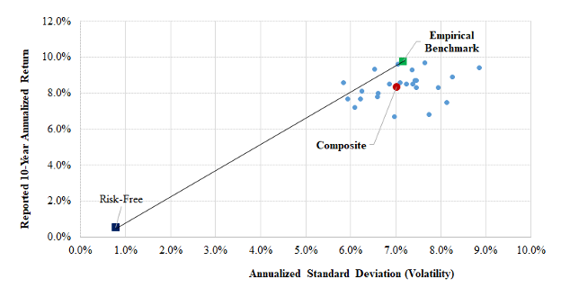
Exhibit 8 illustrates the compatibility of the two performance measures in a different way. It is the same risk–return diagram as shown in Exhibit 4, with the addition of a plot point for the empirical benchmark for the composite of funds. It tells us that the Sharpe ratio (risk-adjusted return) of the passively investable empirical benchmark exceeds those of all but a handful of the managed funds and that the benchmark outperformed the composite by approximately 1.4% a year at essentially the same level of risk. These results indicate that, with relatively few exceptions, active management failed fund trustees and stakeholders, at least during the 10 years of this analysis.
Exhibit 8
Risk–Return Results Including the
Empirical Benchmark
Summary
Two approaches to performance measurement, both rooted in finance theory and widely employed by academics and serious practitioner-researchers, yield consistent results. They indicate that the vast majority of the funds underperformed passive investment over a recent 10-year period. The average margin of underperformance is –1.41% a year. The margin of underperformance is in line with my estimate of the cost of investing large public pension funds, which is 1.2% per year. There are, of course, limitations to our ability to interpret the results. We are dealing with a sample of 24 funds, which is less than half the number of large statewide public pension funds in the United States. The results are for a single 10-year period. Reported returns are not independently verified. Comparative cost data are sketchy and need to be estimated. Nevertheless, the results reported here paint a decidedly unflattering picture of the stewardship of public pension funds. If, in fact, $4.5 trillion of public pension fund assets are underperforming by 1.4% annually, it would amount to an outright waste of $63 billion a year, moneys that could well be applied to the payment of benefits or the reduction of taxes.
PERFORMANCE EVALUATION: IN PRACTICE
Benchmarking Practices
The empirical benchmarks discussed previously consist of just three broad market index components and are passively investable. This type of benchmark provides a baseline for determining whether portfolio management is adding value in excess of purely passive implementation. It yields a result that has a valid economic identity, namely, a risk premium earned. Finance scholars and serious practitioner-researchers invariably use such passively investable benchmarks in evaluating investment performance.
Public pension funds use benchmarks of their own devising, describing them variously as “policy,” “custom,” “strategic,” or “composite” benchmarks. I refer to them as reporting benchmarks (RBs). In addition to incorporating stock and bond components, RBs may include components related to private equity, hedge funds, real estate, commodities, and other alternative assets. Both the traditional and alternative components often have multiple subcomponents, which can make the RB complex. RBs are often opaque and difficult to replicate independently. RBs invariably include one or more active investment return series and thus are not passively investable. They are subjective in several respects, rendering their fashioning something of a black art. Moreover, they are devised by the funds’ staff and consultants, the same parties that are responsible for recommending investment strategy, selecting managers, and implementing the investment program. In other words, the benchmarkers have conflicting interests, acting as player as well as scorekeeper. To state the obvious, perhaps, RBs generally do not measure up to the standards of objectively determined, passively investable benchmarks used by scholars and serious practitioner-researchers.
Hugging the Portfolio
Public fund portfolios often exhibit close year-to-year tracking with their RB. This results in part from how RBs are revised over time. Sometimes revisions are motivated by a change in asset allocation, which may warrant adjusting the benchmark. Often, though, the revisions are more a matter of periodically revising (tweaking) the benchmark to more closely match the execution of the investment program.
No doubt the benchmarkers see such tweaking as a way of legitimizing the benchmark, so that it better aligns with the actual market, asset class, and factor exposures of the fund. It accomplishes that, to be sure. But it also reduces the value of the benchmark as a performance gauge, because the more a benchmark is tailored to fit the process being measured, the less information it can provide. At some point, it ceases to be a measuring stick altogether and becomes merely a shadow.
We talk about “hugging the benchmark” in portfolio management. Here is a different twist on that theme, with the benchmarks hugging the portfolio.
CalPERS: A Case Study
The California Public Employees’ Retirement System (CalPERS) is fairly typical in its approach to performance reporting: It uses an RB and tweaks it with some regularity. So, in addition to being large and prominent, CalPERS serves as a good representative for the sector as a whole. Thus, what follows is not intended to single CalPERS out or present it in an unfavorable light, but rather to demonstrate how public funds present their investment results. Exhibit 9 compares CalPERS’s total fund rate of return with that of its RB and an empirical benchmark (EB) of the type described previously. The CalPERS EB comprises 79% US and non-US stocks and 21% US investment-grade bonds.
Exhibit 9
CalPERS Benchmarking and Performance: An Analysis
|
Fiscal Year Ending |
CalPERS Total Fund Return |
Reporting Benchmark Return |
Difference |
Empirical Benchmark Return |
Difference |
|
2011 |
21.7% |
21.8% |
-0.1% |
23.6% |
-1.9% |
|
2012 |
0.1 |
0.7 |
-0.6 |
2.2 |
-2.1 |
|
2013 |
13.2 |
11.9 |
1.3 |
13.8 |
-0.6 |
|
2014 |
18.4 |
18.0 |
0.4 |
18.6 |
-0.2 |
|
2015 |
2.4 |
2.5 |
-0.1 |
3.8 |
-1.4 |
|
2016 |
0.6 |
1.0 |
-0.4 |
1.4 |
-0.8 |
|
2017 |
11.2 |
11.3 |
-0.1 |
13.3 |
-2.1 |
|
2018 |
8.6 |
8.6 |
0.0 |
9.2 |
-0.6 |
|
2019 |
6.7 |
7.1 |
-0.4 |
7.5 |
-0.8 |
|
2020 |
4.7 |
4.3 |
0.4 |
5.5 |
-0.8 |
|
|
|
|
|
|
|
|
Annualized Return (10 years) |
8.54% |
8.51% |
0.03% |
9.68% |
-1.14% |
|
Annualized SD/TE |
7.4% |
7.1% |
0.5% |
7.3% |
0.7% |
|
R2 with Total Fund |
0.995 |
0.991 |
CalPERS’s portfolio return tracks that of the RB extraordinarily closely. The 10-year annualized returns differ by all of 3 bps, 8.54% versus 8.51%. Year to year, the two-return series move in virtual lockstep, as demonstrated by the measures of statistical fit—an R2 of 99.5% and tracking error of just 0.5%—and even by simple visual inspection of the annual return differences. For example, excluding fiscal years 2012 and 2013, the annual return deviations from the RB are no greater than 0.4%. This is a skintight fit.
CalPERS’s EB return series also has a close statistical fit with CalPERS’s reported returns in terms of R2 and tracking error, although not as snug a fit as with the RB. Moreover, there is an important difference in the level of returns. Whereas CalPERS’s 10-year annualized return is virtually identical to that of its RB, it underperforms the EB by 114 bps a year. And it does so with remarkable consistency: in 10 years out of 10.
The return shortfall relative to the EB is statistically significant, with a t-statistic of –2.9. And it is of huge economic significance: A 114 bp shortfall on a $470 billion portfolio is more than $5 billion a year, a sum that would fund a lot of pensions.
Benchmark Bias
Exhibit 10 compares the 10-year annualized return of the reporting and empirical benchmarks for the 24 statewide pension funds. The RB returns are as reported in the funds’ June 30, 2020, annual reports. The EB returns are those shown in Exhibit 5. Exhibit 10 also shows the difference that results from subtracting the latter from the former; the funds are sorted on the differences in descending order. If we assume that both RBs and EBs are unbiased, we would expect the differences to average approximately zero. But that is not the case. Rather, all but one of the differences are negative. Twenty-one of the 24 funds exhibit a negative difference of greater than 50 bps a year, which might serve as an intuitive threshold for reasonable variation. The average difference is a notable 170 bps, with some greater than 400 bps. The RB returns exhibit a pervasive, large downward bias relative to those of the EBs.
Exhibit 10
Benchmark Comparison
|
Fund
|
Reporting Benchmark Return |
Empirical Benchmark Return |
Difference (RBR – EBR) |
|
|
|
|
|
|
Iowa (PERS) |
8.80% |
8.27% |
+0.53% |
|
Washington |
7.96 |
8.08 |
-0.12 |
|
Minnesota |
9.50 |
9.76 |
-0.26 |
|
California (STRS) |
9.42 |
10.22 |
-0.80 |
|
North Carolina |
7.00 |
7.98 |
-0.98 |
|
Texas (Teachers) |
8.40 |
9.46 |
-1.06 |
|
Maine |
7.70 |
8.77 |
-1.07 |
|
Florida |
7.98 |
9.13 |
-1.15 |
|
N.Y. State (Teachers) |
9.80 |
11.04 |
-1.24 |
|
California (PERS) |
8.40 |
9.68 |
-1.28 |
|
Rhode Island |
7.67 |
8.98 |
-1.31 |
|
Ohio (School Employees) |
8.10 |
9.50 |
-1.40 |
|
Vermont (Teachers) |
6.80 |
8.21 |
-1.41 |
|
Virginia |
7.60 |
9.12 |
-1.52 |
|
Illinois (SERS) |
8.30 |
9.94 |
-1.64 |
|
New Jersey |
7.87 |
9.63 |
-1.76 |
|
South Carolina |
6.63 |
8.84 |
-2.21 |
|
Pennsylvania (PSE) |
7.50 |
9.73 |
-2.23 |
|
Oregon |
9.02 |
11.27 |
-2.25 |
|
Illinois (TRS) |
9.00 |
11.53 |
-2.53 |
|
Arizona (SRS) |
7.80 |
10.45 |
-2.65 |
|
New Mexico (PERA) |
7.30 |
11.01 |
-3.71 |
|
South Dakota |
8.60 |
12.81 |
-4.21 |
|
Missouri (SERS) |
6.30 |
10.79 |
-4.49 |
|
|
|
|
|
|
Average |
8.06% |
9.76% |
-1.70% |
Exhibit 11 separates the difference in benchmark return into two components: excess return and the margin of value-added reported in the annual report. The reported value-added figures are decidedly on the positive side, namely, 19 of 24 (or 79%) are positive. The average margin of value-added is +0.29%. The overall picture is a rosy one, with about 8 out of 10 funds beating their benchmarks by modest amounts. Excess returns tell a very different story. The average excess return is –1.41%, and all but two of them are negative.
Exhibit 11
Comparison of Reported Value-Added and Excess Return
|
Fund
|
Reported Value- Added |
Excess Return
|
Difference |
|
|
|
|
|
|
Iowa (PERS) |
-0.22% |
0.31% |
0.53% |
|
Washington |
1.39 |
1.27 |
-0.12 |
|
Minnesota |
0.20 |
-0.06 |
-0.26 |
|
California (STRS) |
-0.12 |
-0.92 |
-0.80 |
|
North Carolina |
0.70 |
-0.28 |
-0.98 |
|
Texas (Teachers) |
0.10 |
-0.96 |
-1.06 |
|
Maine |
0.60 |
-0.47 |
-1.07 |
|
Florida |
0.71 |
-0.44 |
-1.15 |
|
N.Y. State (Teachers) |
-0.20 |
-1.44 |
-1.24 |
|
California (PERS) |
0.10 |
-1.18 |
-1.28 |
|
Rhode Island |
0.13 |
-1.18 |
-1.31 |
|
Ohio (School Employees) |
0.50 |
-0.90 |
-1.40 |
|
Vermont (Teachers) |
0.40 |
-1.01 |
-1.41 |
|
Virginia |
0.50 |
-1.02 |
-1.52 |
|
Illinois (SERS) |
0.40 |
-1.24 |
-1.64 |
|
New Jersey |
0.12 |
-1.64 |
-1.76 |
|
South Carolina |
0.08 |
-2.13 |
-2.21 |
|
Pennsylvania (PSE) |
0.20 |
-2.03 |
-2.23 |
|
Oregon |
-0.51 |
-2.76 |
-2.25 |
|
Illinois (TRS) |
-0.70 |
-3.23 |
-2.53 |
|
Arizona (SRS) |
1.10 |
-1.55 |
-2.65 |
|
New Mexico (PERA) |
0.20 |
-3.51 |
-3.71 |
|
South Dakota |
0.81 |
-3.40 |
-4.21 |
|
Missouri (SERS) |
0.50 |
-3.99 |
-4.49 |
|
|
|
|
|
|
Average |
+0.29% |
-1.41% |
-1.70% |
|
Percentage Positive |
79% |
8% |
4% |
What to make of the results? In general, the funds report beating their benchmarks but overwhelmingly underperform passively investable ones. By its nature, the method for establishing empirical benchmarks is transparent, objective, and unbiased. Although the empirical benchmarks are undoubtedly imperfect, there is no reason to believe that they are biased. The same cannot be said for the RBs. The RBs are subjectively determined by the same parties responsible for implementing the investment program. Most RBs lack transparency. They invariably incorporate active-return series, especially for alternative investment strategies, which have been shown to have underperformed passive investment over the period under study.[15] One is left to conclude that RBs are biased downward to a significant extent. Fund performance relative to the reported benchmark is overstated by a like margin.
SUMMARY
I estimate that statewide pension funds in the United States incur annual investment expenses averaging 1.2% of asset value. A sample of 24 of them underperformed passive investment during a recent decade by an average of 1.4% a year. And yet, those same funds report that they outperformed benchmarks of their own devising by an average of +0.3% a year for the same period. This sharp disconnect raises questions about the usefulness of the funds’ performance reporting, as well as their heavy reliance on expensive active management. Altogether, the results paint an unflattering portrait of the stewardship of public pension funds in the United States.
REFERENCES
Aubry, Jean-Pierre, and Kevin Wandrei. 2020. “Internal Vs. External Management for State and Local Pension Plans.” Center for Retirement Research at Boson College, No. 75, November.
Ben-David, I., J. Birru and A. Rossi. 2020. “The Performance of Hedge Fund Performance Fees.” Fisher College of Business Working Paper No. 2020-03-014, Charles A. Dice Working Paper No. 2020-14. SSRN: https://ssrn.com/abstract=3630723 or
http://dx.doi.org/10.2139/ssrn.3630723.
Bollinger, M. A., and J. L. Pagliari. 2019. “Another Look at Private Real Estate Returns by Strategy.” The Journal of Portfolio Management Real Estate Special Issue 45 (7): 95–112.
Brown, Stephen J., and William N. Goetzmann. 2003. “Hedge Funds with Style.” The Journal of Portfolio Management29 (2): 101–112.
Callan Institute. 2019. “2019 Investment Management Fee Study.” https://www.callan.com/uploads/2020/05/0ce3d1da04c2c1d8e13a30a67dbdfabe/callan-2019-im-fee-study.pdf.
Carhart, M. M. 1997. “On Persistence in Mutual Fund Performance.” The Journal of Finance 52 (1): 57–82.
CEM Benchmarking Inc. 2018. “Transaction Costs Amongst Large Asset Owners.”
https://www.cembenchmarking.com/research/Transaction_Cost_Amongst_Large_Asset_Owners_-_Sept_2018.pdf.
Cliffwater LLC. 2020. “Long-Term State Pension Performance, 2000-2019.” https://www.cliffwater.com.
Dang, A., D. Dupont, and M. Heale. 2015. “The Time Has Come for Standardized Total Cost Disclosure for Private Equity.” CEM Benchmarking Inc. https://www.cembenchmarking.com/research/CEM_article_-_The_time_has_come_for_standardized_total_cost_disclosure_for_private_equity.pdf.
Ennis, R. M. 2021. “Alternative Investments: The Fairy Tale and The Future.” Forthcoming, Journal of Investing.
Fama, E. F., and K. R. French. 2010. “Luck versus Skill in the Cross-Section of Mutual Fund Returns.” The Journal of Finance 65 (5): 1915–1947.
French, K. R. 2008. “The Cost of Active Investing.” https://ssrn.com/abstract=1105775 or http://dx.doi.org/10.2139/ssrn.1105775.
Fragkiskos, A., S. Ryan, and M. Markov. 2018. “Alpha and Performance Efficiency of Ivy League Endowments: Evidence from Dynamic Exposures.” Alternative Investment Analyst Review 7 (2):19–33.
Halim, S., and M. Reid. 2020. “Asset Owners Report Half of All Costs.” Top 1000 Funds, November.
Hooke, J., and K. C. Yook. 2018. “The Grand Experiment: The State and Municipal Pension Fund Diversification into Alternative Assets.” The Journal of Investing Fall (supplement): 21–29.
Ibbotson, R. G., P. Chen, and K. X. Zhu. 2010. “The ABCs of Hedge Funds: Alphas, Betas, and Costs.” Financial Analysts Journal 67 (1).
Illinois Civic Federation. 2019. “Study Examines Public Pension Investment Costs.” https://www.civicfed.org/iifs/blog/study-examines-public-pension-investment-costs.
Jurek, J. W., and E. Stafford. 2015. “The Cost of Capital for Alternative Investments.” The Journal of Finance 70 (5): 2185–2226. https://doi.org/10.1111/jofi.12269.
McKinsey & Co. 2017. “Equity Investments in Unlisted Companies.” https://www.regjeringen.no/globalassets/upload/fin/statens-pensjonsfond/eksterne-rapporter-og-brev/2017/20171101-equity-investments-in-unlisted-companies-v.f.pdf.
Nesbitt, S. L. 2019. Private Debt. John Wiley & Sons, Inc.
Pew Charitable Trusts. 2016. “Making State Pension Investments More Transparent.”
https://www.pewtrusts.org/en/research-and-analysis/issue-briefs/2016/02/making-state-pension-investments-more-transparent.
Phalippou, L., and O. Gottschalg. 2009. “The Performance of Private Equity Funds.” The Review of Financial Studies 22 (4): 1747–1776.
Sharpe, W. F. 1988. “Determining a Fund’s Effective Asset Mix.” Investment Management Review 2 (6): 16–29.
——. 1992. “Asset Allocation: Management Style and Performance Measurement.” The Journal of Portfolio Management 18 (2): 7–19.
[1] Public Plans Data (https://publicplansdata.org), Center for Retirement Research at Boston College.
[2] The constraints are that regression weights (1) be nonnegative and (2) sum to 100%.
[3] Other studies (e.g., Brown and Goetzmann 2003 and Fragkiskos et al. 2018) employ approaches that permit time-varying allocations to the independent variables. Owing to (1) the extensive diversification of individual pension funds and (2) the relative stability of their asset allocations over time, I judge Sharpe’s original (static) formulation to be appropriate for the purpose of devising performance benchmarks based on annual returns.
[4] See, for example, Carhart (1997) and Fama and French (2010).
[5] See Illinois Civic Federation (2019).
[6] Halim and Reid (2020), citing CEM Benchmarking (https://www.top1000funds.com/2020/11/asset-owners-report-half-of-all-costs/ estimates).
[7] See Dang et al. (2015) for a discussion of the progressive efforts of the South Carolina Retirement System Investment Commission in regard to the collection of comprehensive cost information.
[8] Callan (2019) is the source for fixed income and equities. The estimate for fixed income reflects the fact the endowments’ investments there are a combination of cash (at no cost) plus investment-grade and high-yield-type investments, the latter of which can cost up to 3% of asset value annually.
[9] Phalippou and Gottschalg (2009).
[10] Bollinger and Pagliari (2019). The figure indicated is a blend of rates for core equity, value-add and opportunistic investments.
[11] Ben-David et al. (2020), French (2008), Ibbotson et al. (2010). The 3% figure is somewhat lower than the average reported in the studies.
[12] Morningstar: https://www.morningstar.com/commodity-funds
[13] See Aubrey and Wandrei (2020).
[14] Some consultants and funds use a generic global-equity benchmark for public funds. It typically comprises 70% MSCI ACWI stocks and 30% BB U.S. Aggregate bonds. It meets my criteria for transparency and being passively investable, and it captures the full breadth of the market, making it a plausible candidate as a benchmark. The 70-30 global equity benchmark, however, has an average exposure to non-U.S. equities over the past decade of roughly 35%, compared with a typical exposure of about 20% on the part of public pension funds. In other words, “70-30,” as a benchmark, has had a greater weighting of non-U.S. equities than is characteristic of public funds. Inasmuch as non-U.S. markets significantly underperformed the U.S. market during the study period, this results in the 70-30 equity benchmark underperforming (1) the average return of public funds that it is intended to benchmark and (2) an empirically derived benchmark for the composite. (During the decade under study, the generic 70-30 benchmark had a return of 8.01% per year, compared with 8.35% for the fund composite and 9.76% for its empirical benchmark.) This outcome is at odds with the widely held view that a properly constructed (and calibrated) benchmark should outperform the return series of a super diversified portfolio (composite of two dozen, in this case) by the approximate margin of cost. In other words, the return of the 70-30 global equity benchmark return appears to be biased downward. Moreover, the three-index approach that I use produces a better statistical fit with the data than does the 70-30 global equity benchmark. (For example, the tracking error for the composite relative to 70-30 is 1.38%. Relative to the three-index empirical benchmark for the composite, tracking error is 0.88%, for a 36% smaller margin of error.) For these reasons, I have opted to create empirical benchmarks with separate U.S. and non-U.S. equity allocations tailored to each fund and the composite.
[15] Ennis (2021) reports risk-adjusted returns (alphas) for three principal classes of alternative investments in the 2010s as follows: private equity (–0.9% a year), hedge funds (–3.1% a year) and real estate (–6.0%). The inclusion of underperforming active strategies in the RB drags down its return relative to purely passive execution.